SHISEIDO
AD CAMPAIGN
An individual design project involving
the use of various software tools to maintain brand consistency and effectively promote a product.
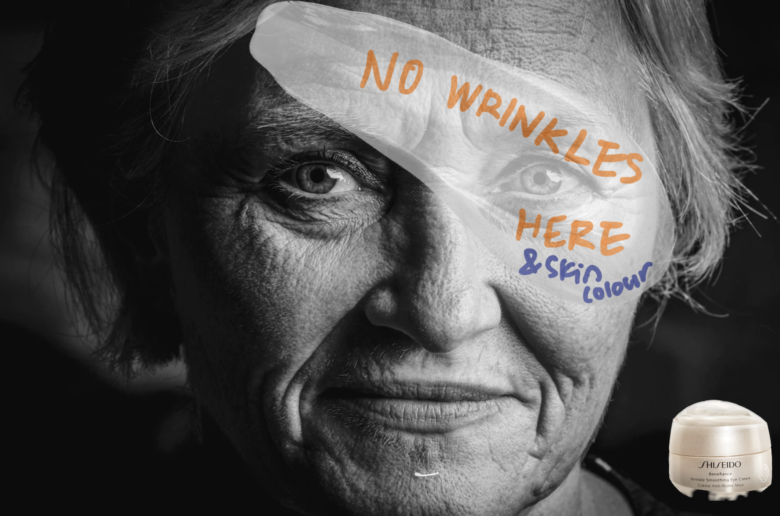
Anti-aging ad campaign idea1
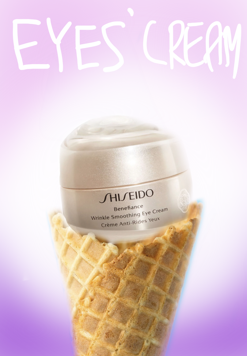
Anti-aging cream ad campaign idea2
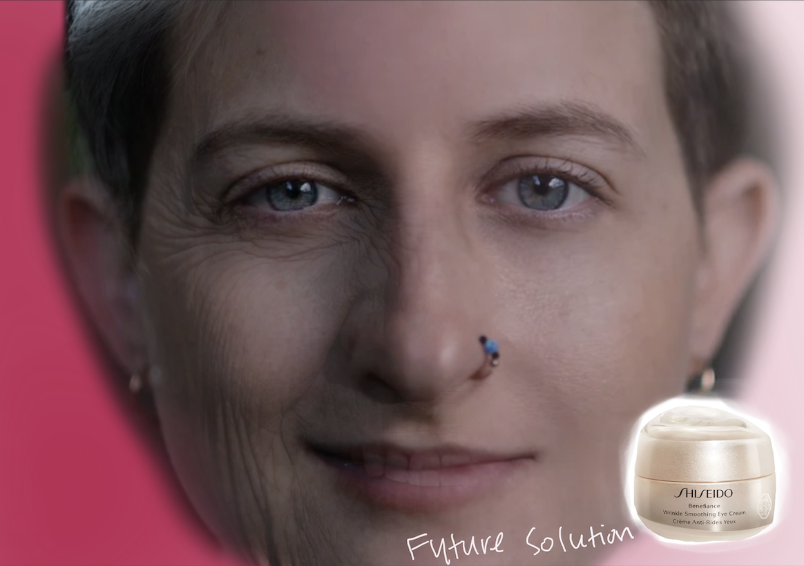
Anti-aging cream ad campaign idea3
This project was my very first endeavour it fills me with a sense of pride. It was a challenging task, especially considering my limited proficiency in using the Adobe Creative Suite at that time, and generating creative ideas proved to be difficult. To overcome these challenges, I experimented with different design styles, utilizing my iPad for drawing in an attempt to extract the best ideas. As a result, I successfully conceptualized a design that highlighted the new chapter of life while establishing connections with Shiseido’s anti-aging cream.
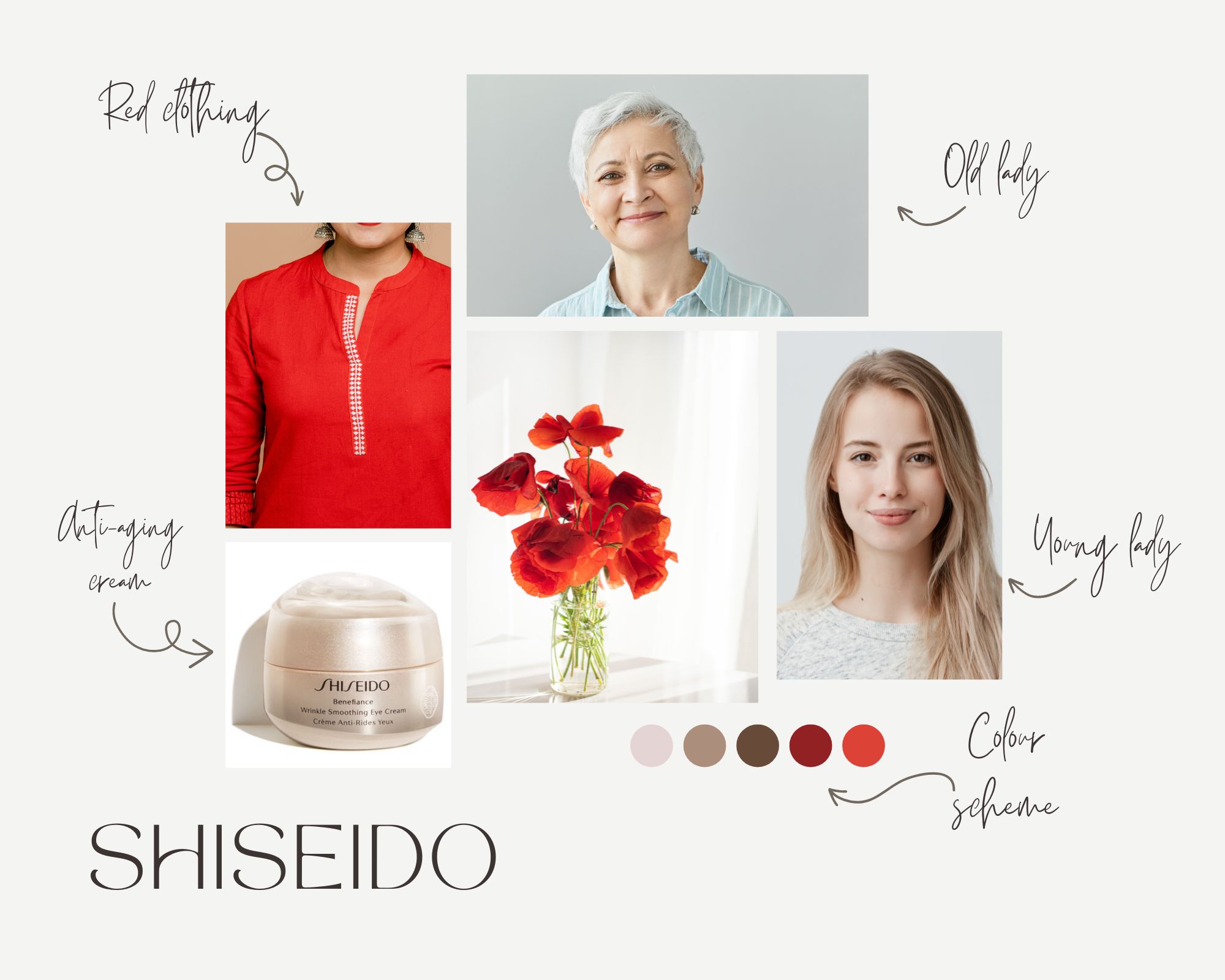
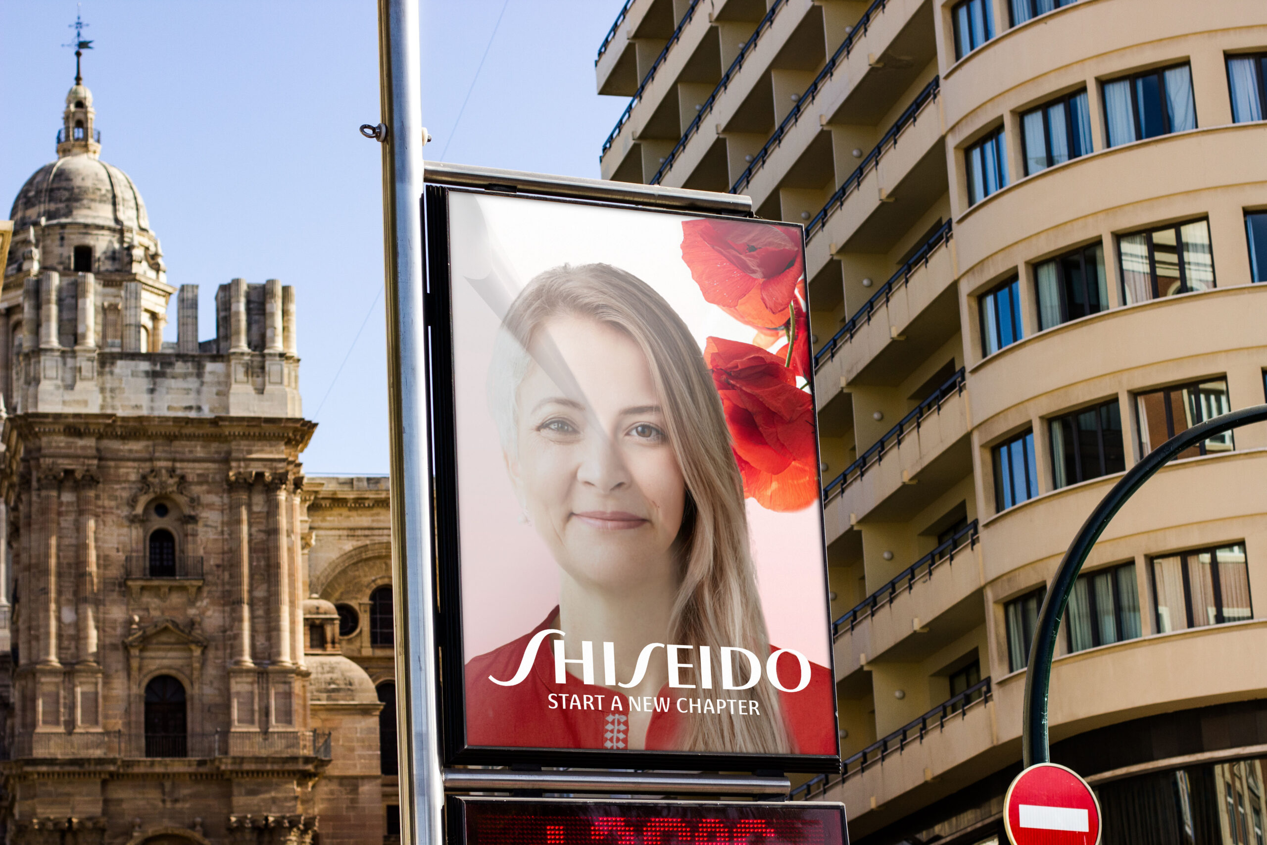
I collected some assets to create the final ad campaign poster, then crafted a mood board to ensure the concept remained cohesive.
By using Photoshop, I altered the model’s clothing to match the brand’s colour and added flowers behind the model to maintain brand consistency. The flipping paper effect was incorporated to give the impression that the audience is peeling back the page, revealing youthful skin over the wrinkled face.
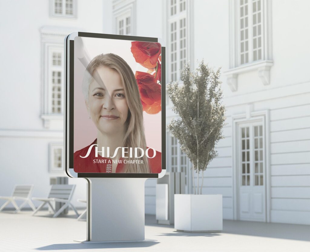
Additionally, I used Photoshop to merge
images of two females into one person,
creating the desired old-and-young effect. These adjustments were made to symbolize the beginning of a new chapter in one’s life, showcasing rejuvenated skin and advertising the impactful results of the product. I am pleased to share that the project was completed as planned, and I am satisfied with the results. It demanded a significant amount of time to make this work, and I am proud of the outcome.
***The Shiseido Ad Campaign project was a mockup that I created independently, not in collaboration with any actual client.***