FOOD TRUCK
DESIGN PROJECT
An individual food truck project aims to showcase branding consistency across various formats: social media posts and banners, food truck mockups,
and bi-fold brochures.
This project was initially designated as a team assignment, but I chose to take on the challenge individually, relying on my skills to see it through. I successfully completed it well before the deadline, and I was pleased with the outcome of my final artwork. The project spanned over two and a half weeks, during which I utilized Photoshop, Illustrator, and InDesign to demonstrate proficiency in multiple software tools. This project needed to establish its unique branding.
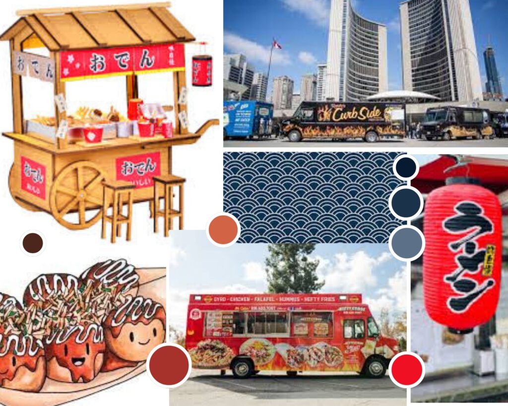
When I received this project, I immediately thought about Takoyaki, a popular street food often sold in food trucks across Asia. It’s a signature dish of street cuisine and enjoys widespread popularity. Consequently, I began gathering elements for my food truck design project by creating a mood board. This mood board incorporates the colours of Japan, decorative patterns, and lights that establish connections with Japanese culture.
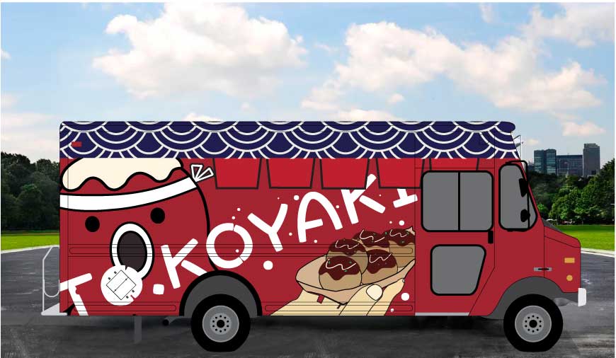
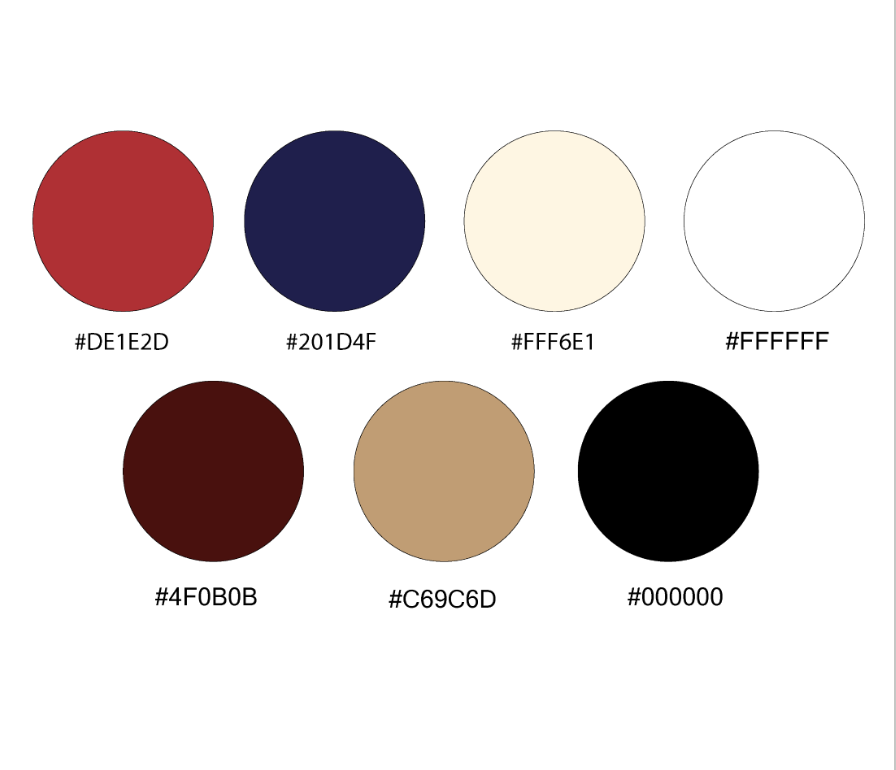
For the unique branding, I have chosen a couple of colour palettes. The food truck was painted in vibrant red, a colour closely associated with Japan, reflecting Japanese cuisine’s essence. This distinctive colour also serves a practical purpose, making it effortless for people to spot the food truck while navigating Toronto street. It can also easily stay in people’s minds due to its powerful impact on colours.
Food Truck Colour Pallet
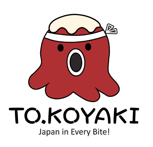
Food Truck Logo Vertical
Food Truck Logo horizontal
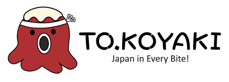
I began by focusing on the logo design for the brand as I believe it serves as a vital representation of the entire brand. Recognizing the importance of a catchy and food truck-related logo, I opted to center my designs around the octopus, the main ingredient in takoyaki. In these designs, the logo character is adorned with takoyaki sauce on its head, establishing a visual link to the actual appearance of the food.
Mockups Design
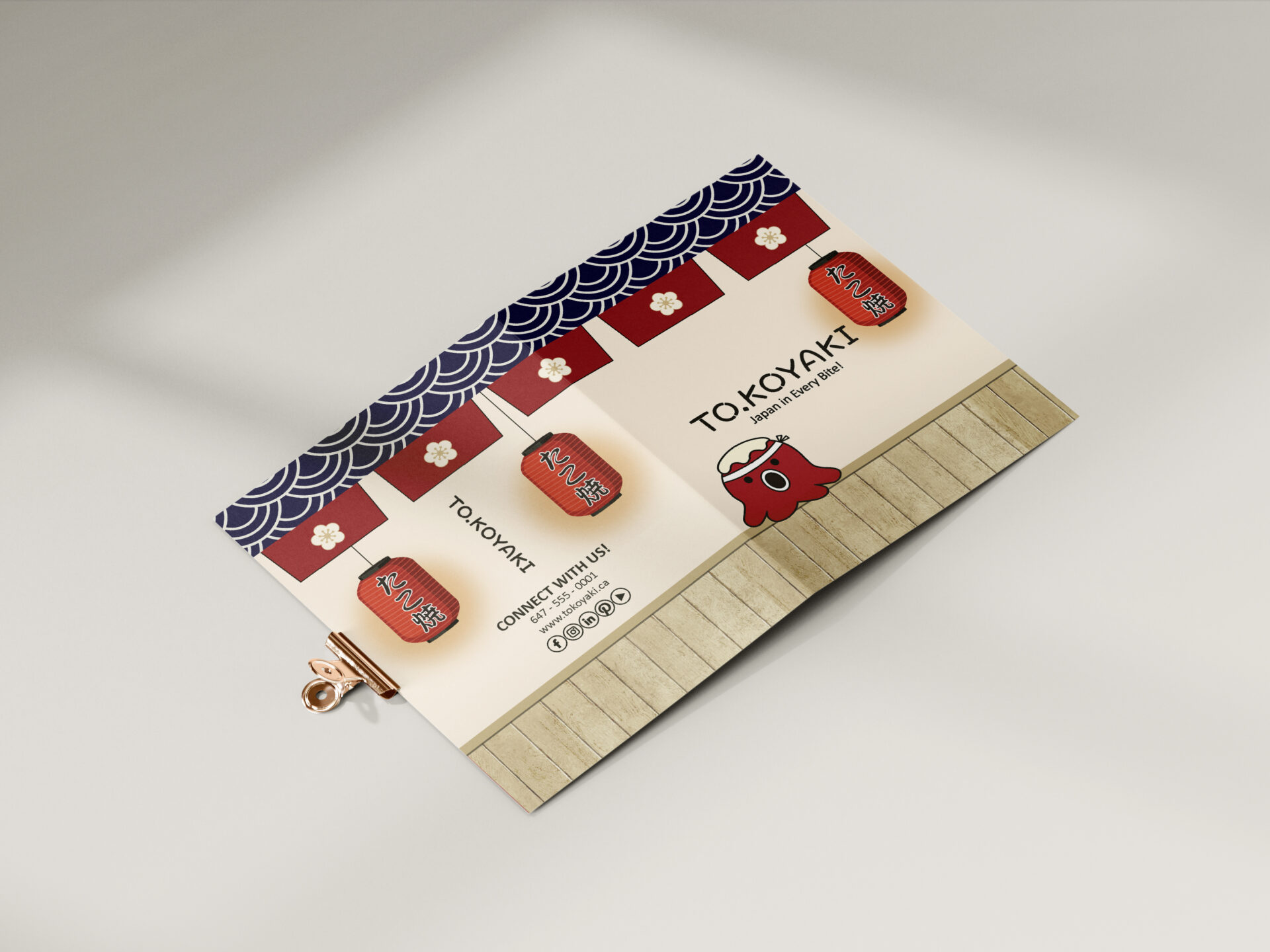
Food truck bi-fold brochure interior mockup
After finalizing the logo for the food truck, I focused on designing the bi-fold brochure to resemble a food truck or restaurant bar area where customers to place their orders. The ambient lighting suspended from the ceiling serves as a menu in Japanese, warmly welcoming customers to explore the offerings. The contact information and the social media platforms are introduced on the back of the brochure.
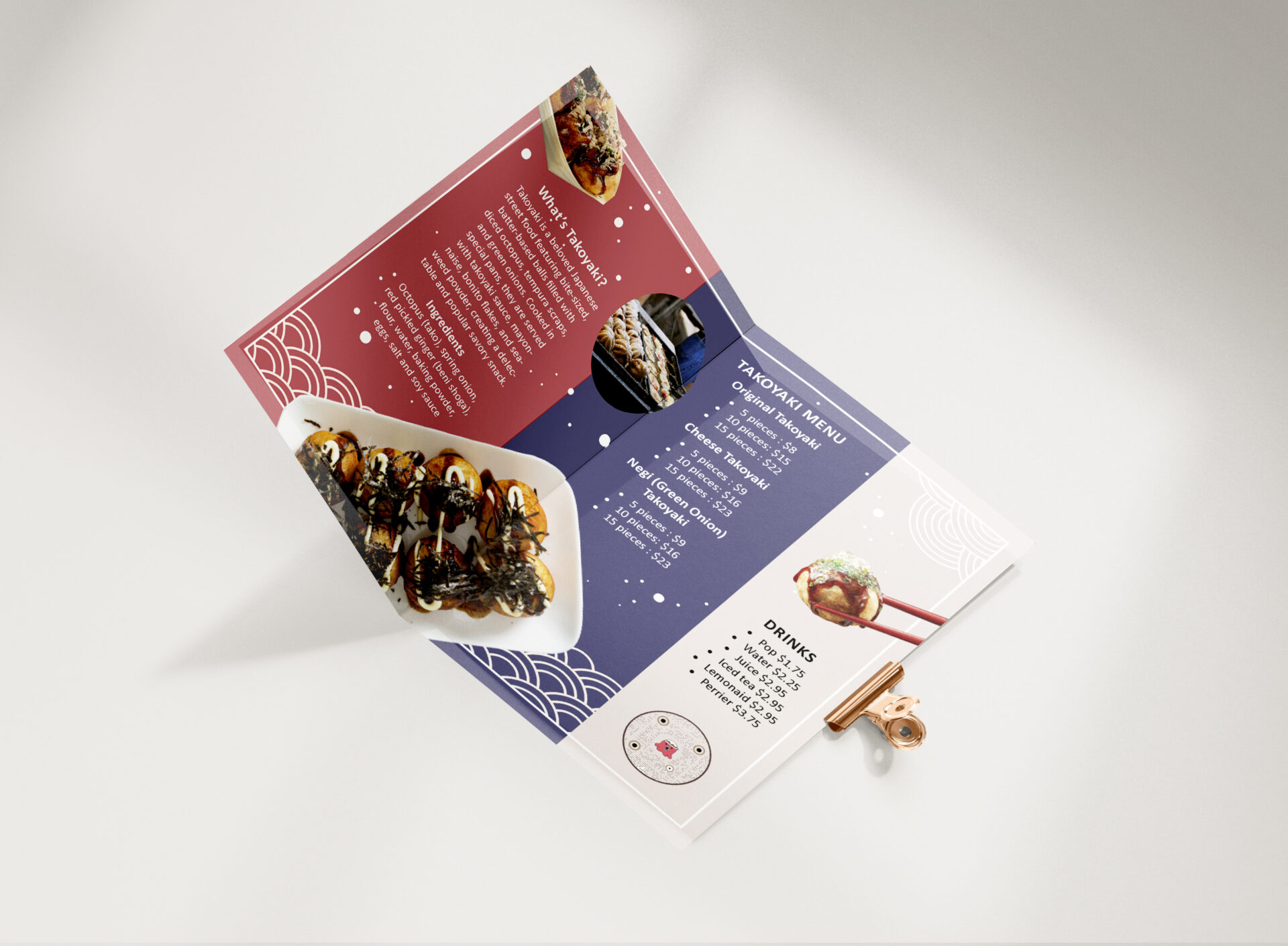
The interior of the bi-fold brochure features an introduction to the food, providing ideas for new customers unfamiliar with the offerings. Visuals of the menus and detailed descriptions are included. The brochure layouts are organically designed to evoke a street food atmosphere, departing from the formal style of traditional restaurant menus. A QR code is strategically placed at the bottom, enabling customers to access additional information about the company and its diverse food options.
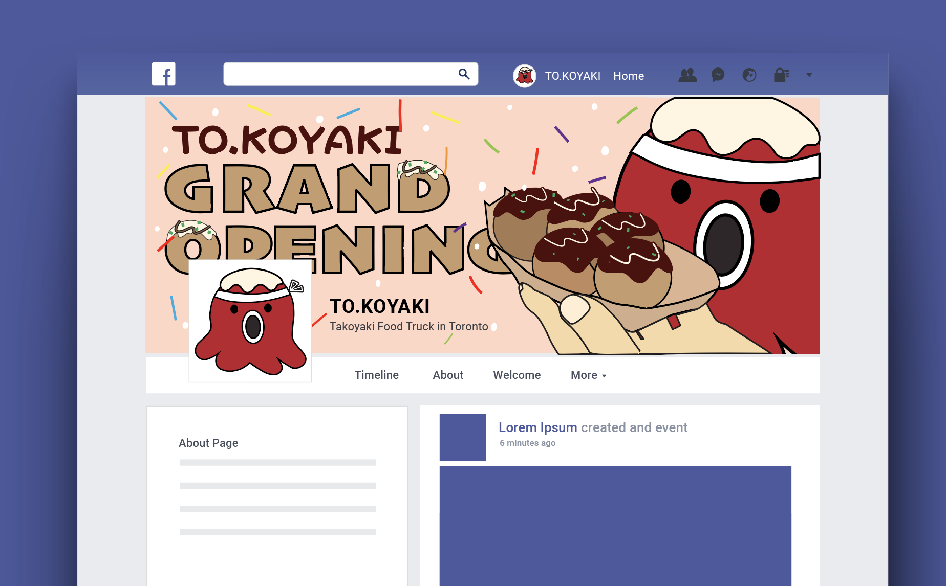
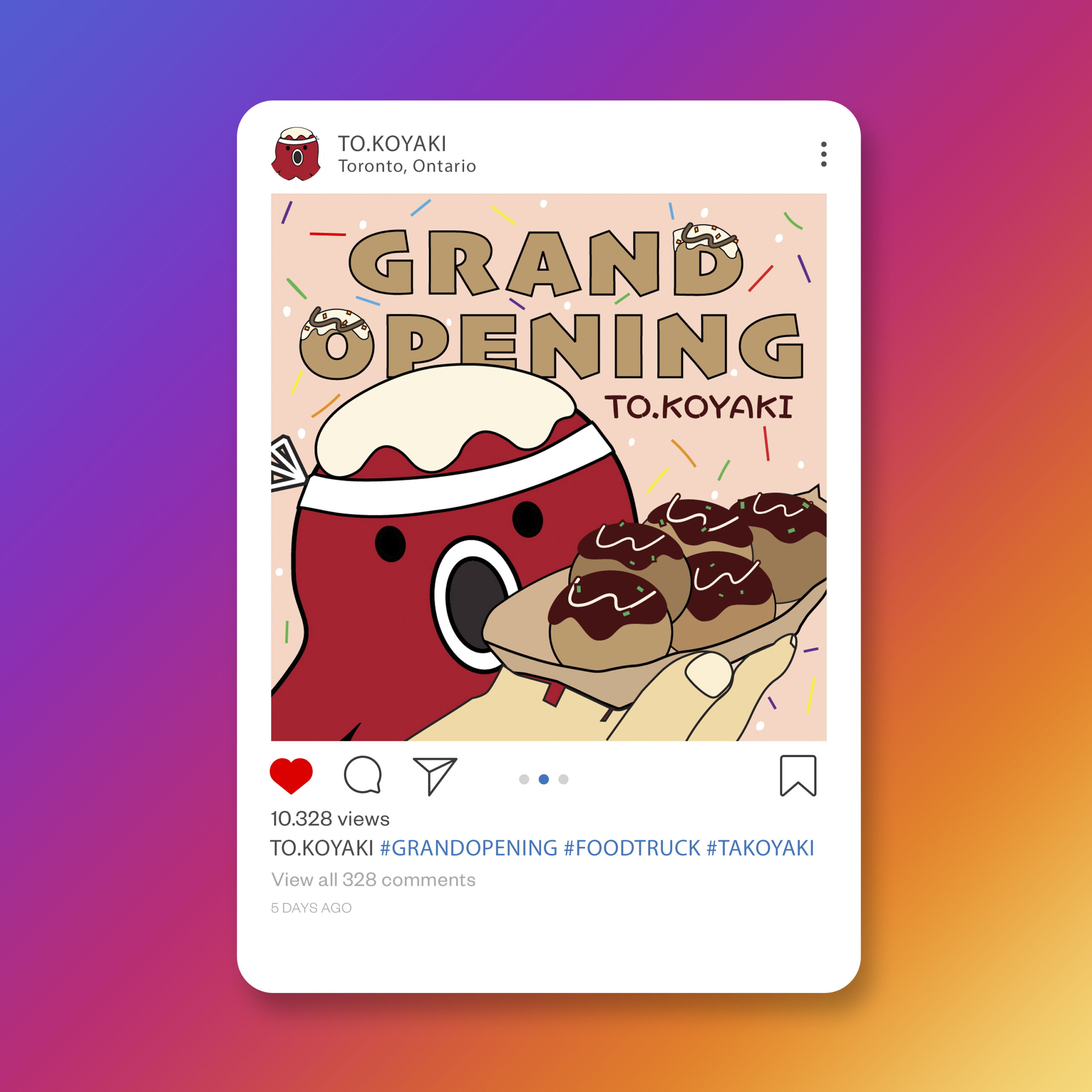
For the final phase of this project, I focused on creating two distinct social media pieces: an Instagram post and a Facebook banner. In comparison to other formats, these designs were relatively straightforward due to my greater experience, presenting no significant challenges in crafting both the takoyaki imagery and promotional content.
Instagram Post Mockup
Facebook banner mockup